This page contains some affiliate links. Please review my disclosure policy.
To say that I’ve been excited about writing this post would be a total understatement. I’ve been OVER THE MOON excited to share this with you. Finally, I can reveal that THM has gotten a new look!
As some of you may remember, I’ve been working on a redesign of THM for a while now. And by “a while”, I mean over a year. The process ended up being way more arduous than it needed to be (more on that below), but now that it’s done, I could not be more thrilled!
But before I jump into the new design, I have the thank the amazing crew who worked with me to make this site a reality:
Saevil Row – Rachelle, I swear this post could become a love letter to you. Your vision was spot on from the start and I couldn’t have asked for a better partner through this process. Thank you for putting up with me and for just about everything!
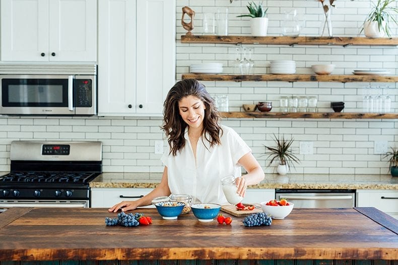
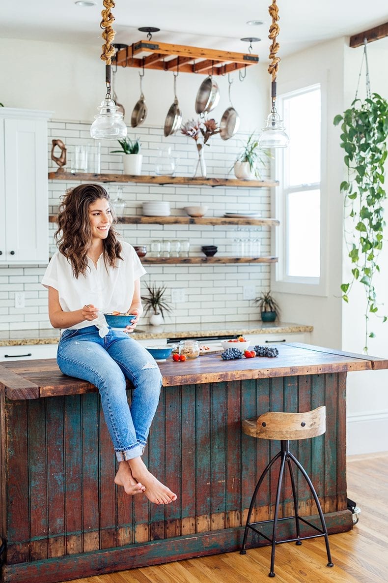
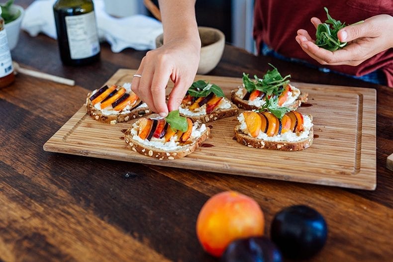
Bettina Bogar – ohhhhh B! You’re a camera wizard, but perhaps more importantly, an incredible friend. Thank you for both recommending Rachelle and for capturing the stunning images for the new site!
Jim Sabellico – My last minute hero and literally the most patient person in the universe. Thank you for calming my nerves when I wrote you that initial frantic email and for creating the ultimate recipe app for you guys!
Okay, now onto the site.
There were some very specific requests I made about what I wanted. After going through this process for the third time (once in 2013, again in 2015, and now), I wanted to be very intentional about the new design so I don’t have to continue this trend of a new THM every 2 years.
1) I wanted a site I could grow into
Though there certainly are some beautiful design elements to the site, I wanted to keep it simple. Rachelle advised me not to go with anything too trendy since we all know trends pass quickly. The blogging world is constantly evolving so it’s important that I leave room to add in elements in the future as things change. Of course, I wanted to put my own little twist on things, but the rule of thumb was to keep it simple.
2) I wanted a site that could showcase everything
I think it comes as no surprise to anyone that I like producing content. Whether it’s a blog post, a video or a podcast episode, I am always putting out new work into the world and I love sharing it all! However, if you came to THM in the past, that wasn’t always the most obvious. Now when you land on THM, you’re given the option to “choose your own adventure”. This allows everyone to find the content they want to see and ignore the stuff they don’t. Which, FYI is totally cool. I don’t expect you to want to read/watch/listen to everything 😉
3) I wanted a more mature vibe
The last time I went through the redesign process, I really wanted to convey “youthfulness” to my audience. It’s not that I no longer feel youthful, it’s just that I’ve done a lot of growing up in the past couple of years and while I certainly have a long way to go, I definitely feel more mature. Even though this space is a reflection of me, I also take my job very seriously and it was important to me that this came across.
4) I wanted the site to feel like a blog
There is a trend right now with blogs being replaced by static homepages that appear more like regular websites than blogs. I totally get the appeal of this (telling people I run a blog full-time always results in some strange looks), but it was important for me to stay true to my roots. The homepage has a bit of both in it now. Certain aspects that are static, but also updates as new content goes live. Once a blogger, always a blogger! Just a slightly more refined one now.
Other than these points, I let Rachelle run with things and we worked with Bettina to create a style guide for the stock images for the site. Once we had a mock-up, B and I rented a location and shot the content in 2.5 hours (because we’re unstoppable when we’re together). I could not be happier with the result!
As I mentioned in this post I initially started the redesign process a year ago with a different team. It’s not my goal to bad mouth anybody and honestly, I take full blame for how things unfolded but let’s just say that it was a bit of a disaster. I let a friend convince me that I needed a new direction and complete overhaul of THM in a way that truthfully, made me very uncomfortable. A lot of time and money was wasted on a site that never came to fruition, but hey, at least it was a learning experience! It wouldn’t be a THM post without a little Maven advice so here goes:
WORDS OF WISDOM FOR A REDESIGN
1) Get recommendations.
I can’t stress this enough. Ask your friends who designed their sites or check out your favorite bloggers and see if their designer is listed at the bottom of their homepage and then email the blogger to see if they’d recommend them. Don’t let your uncle’s, friend’s dog walker design your site as a favor or because they’ll do it for cheap. You want to see a portfolio before you jump into anything.
2) Don’t cut corners.
Designers are expensive. If I’ve learned anything from doing this three times, it’s that the more you invest, the more you’ll get in return. That’s not to say that you need to spend 10k on a new website, but you’re going to have to put a couple Gs down to get a site that not only is beautiful, but is also functional. Cutting corners will lead to future redesigns and more work on your end.
3) Be upfront about your non-negotiables.
This is something that I wish I’d known before entering into this process. You know your business better than anyone, and while something as simple as a commenting function may seem silly to your designer, it can be a make-or-break issue for you.
4) Find a designer you vibe with.
This is probably the most important piece. You’re going to be working closely together on a pretty important project, so you’re going to want to get along. But more than that, make sure your communication styles line-up. I’m a control freak about a lot of things, but I also know I’m not a designer, so I default to my web designer for concepts. Other web designers prefer working with clients who have a very specific vision that they then bring to life. Find out what kind of designer you’re working with, and make sure you guys are able to communicate with each other throughout the process.
* * * * *
I know that the points above probably aren’t relevant for most of you, but hopefully I’ve helped some of my fellow bloggers out there who are thinking about or heading into a redesign.
In terms of THM, besides a new store-front, the merchandise will remain the same inside! Still plenty more life updates, recipes, healthy living tips, videos and podcast episodes (once we’re back from hiatus) coming your way.
In the meantime, enjoy exploring the new site!
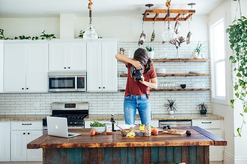
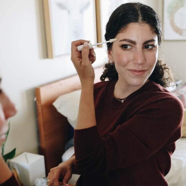
*All pictures courtesy of the amazing Bettina Bogar


Your new site is AMAZING!! The photos are so gorgeous. Also, this post came at the perfect time as I’m literally working on my website redesign right now and completing some homework for the designer! 🙂 Thanks for the tips.